In a nutshell
In this project, we were asked to create an information architecture that supports multi and cross-channel experience for Hong Kong people who are interested in the US election 2016. Our team was assigned to focus on the election day leading up to the announcement.
Challenges
Given the target users profile, we had to think about how the information architecture supports the needs and behavior of the users in the assigned scenario and how to create a seamless cross-channel experience.
Solutions
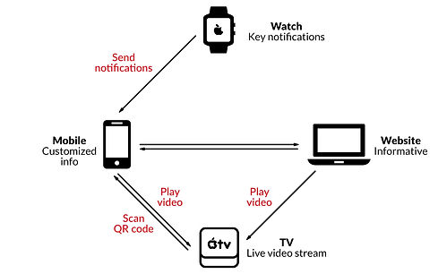
We designed an information architecture for multiple channels, including desktop & mobile-friendly website, mobile app, smartwatch app and app for Apple TV.

Cross-Channel Experience
Target User

"The target users of the imaginary service are Hong Kong people who are interested in the US election and have witnessed at least two past US elections via the media."
Scenario


User Journey
(Graphic design by Qinglin ZHENG)
Sitemap

Responsive Web Design
(Designed by Angela Mei NG)


Wireframe - WatchOS
